Website update: code blocks, search, lightbox and more!

Table of contents
Since I got my website to a relative production-ready stage last year, I wanted to release an update to my website to work on a few much-needed improvements.
Revamped post experience
I've always felt like my posts layout has felt pretty bland, which doesn't integrate with the rest of my website design. I started off building my website from Next.js' WordPress example, which, although modern in its design, is very minimal. I decided to add a few features to build on my existing content:
Code blocks
As I constantly write posts about programming, code blocks are an elemental part of my posts. The code blocks I started off with use Prism.js, however I knew from the beginning that this was a temporary solution. While it does support a lot of languages for syntax highlighting, it lacks support for things such as file trees, and interactive code playgrounds. A package that has been all the rave in the dev environment as of late is Sandpack by CodeSandbox. It's a Javascript-oriented playground that features the same in-browser bundler used on CodeSandbox for running client-side node.js. It's very performant and has excellent code formatting and file tree support. The only thing it lacks is support for languages other than Javascript, say if you want to use it not for the previews but just for code blocks.
The old code block
export default function Hello(){
  return (<h1>Hello, world!</h1>)
}
The new playground
Full-bleed images and lightbox
Most online reading experiences feature full-bleed images, meaning that images in a post expand to the size of the browser content while the text remains within its container (it's not a good practice to have text span across wide screens as it makes it hard to read). I implemented a CSS class for these kind of images.

Another feature on sites such as Medium is that one can click on images in a post to expand them. This is called a Lightbox. While I haven't converted all post images to lightboxes yet due to performance issues and a few quirks I have to fix, here's a preview (click on the image to expand it) :
Post headers
Something I didn't like with Next.js' wordpress example is the look of posts. Everything is huge, and while that might be the look they are going for, it's tiring having to scroll everywhere. For instance, the cover image is positioned under the fold, which means that a visitor needs to scroll before deciding if they want to read the post based on the title and cover image. I decided on a responsive design to make sure the cover image is above the fold on all devices.
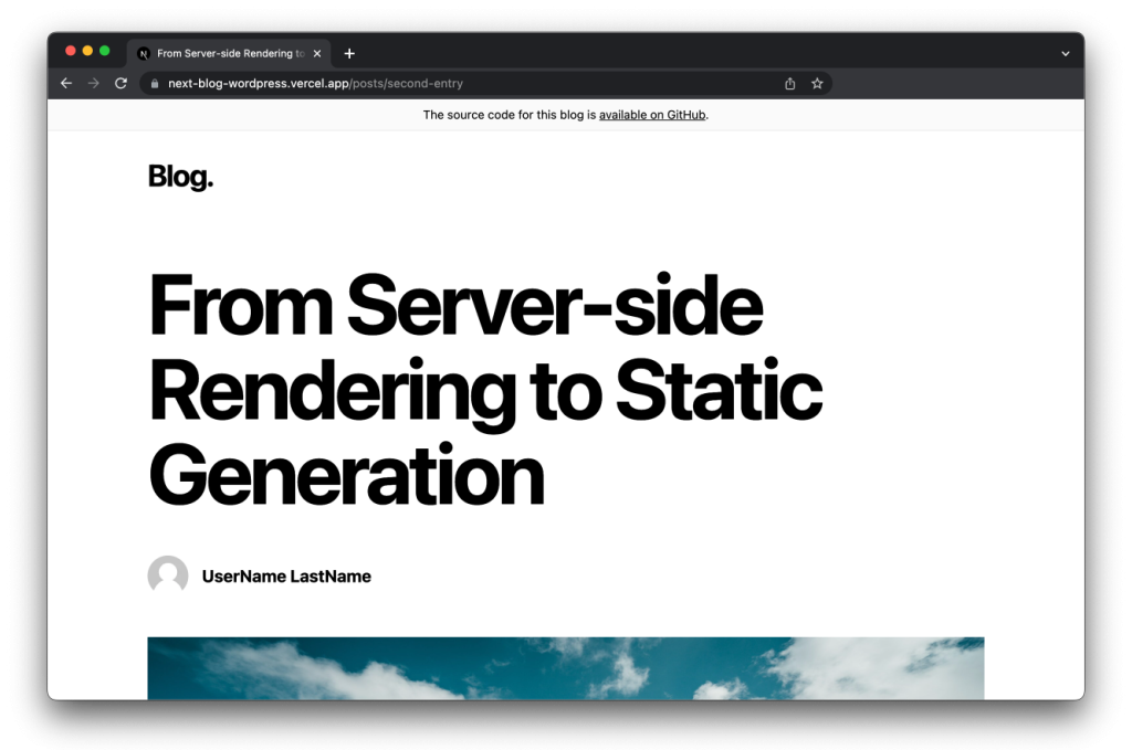
I also decided to include small flourishes such as drop caps, which felt authentic to my design.
Post categories and search
Something I've wanted to do from day one is to implement a post search feature. I initially thought it would be quite time consuming, with hacky fetches and asynchronous calls to my CMS, but I realized that I could do all the searches client-side with Kent C. Dodd's match-sorter package. I also wanted to make post categories visible to users. Since they are already implemented in the CMS I use (WordPress) I only had to do half the work and implement it client-side. Since I have a lot of whitespace, I found a space for my search bar and categories elements.
Header and footer
I wasn't very happy with the header transition I have – as you scroll and it collapses, it's always felt a little jittery. I replaced my trigger-based animation (i.e. when you scroll past a certain point, the size transitions) with a scroll-based animation (i.e. the scroll controls the animation progress). Here's the difference:
import './styles.css' import { useState, useEffect } from 'react' export default function App(){ const [expanded, setExpanded] = useState(true); useEffect(() => { document.addEventListener('scroll', scroll) return ()=>{ document.removeEventListener('scroll', scroll) } },[]) function scroll(){ setExpanded(window.scrollY <= 50) } return ( <div className='container'> <div className={'header' + (expanded ? ' expanded' : '')}> <h1>Header </h1> <p>{expanded ? 'Expanded' : 'Collapsed'}</p> </div> </div> ) }
Trigger-based animation
import './styles.css' import { useState, useEffect } from 'react' export default function App(){ const [progress, setProgress] = useState(0); useEffect(() => { document.addEventListener('scroll', scroll) return ()=>{ document.removeEventListener('scroll', scroll) } },[]) function scroll(){ setProgress(Math.max(Math.min(window.scrollY / 50, 1), 0)) } return ( <div className='container'> <div className={'header'} style={{'--progress': progress}}> <h1>Header </h1> <p>Progress: {progress}</p> </div> </div> ) }
Scroll-based animation
Notice how in the first example, the header stays expanded, right until you scroll past a certain point? The scroll-based animation feels much more responsive as it adapts to your scrolling speed.
When it comes to the footer, I never got to finishing it. I spent time positioning the links to social media and other items I wanted to feature.

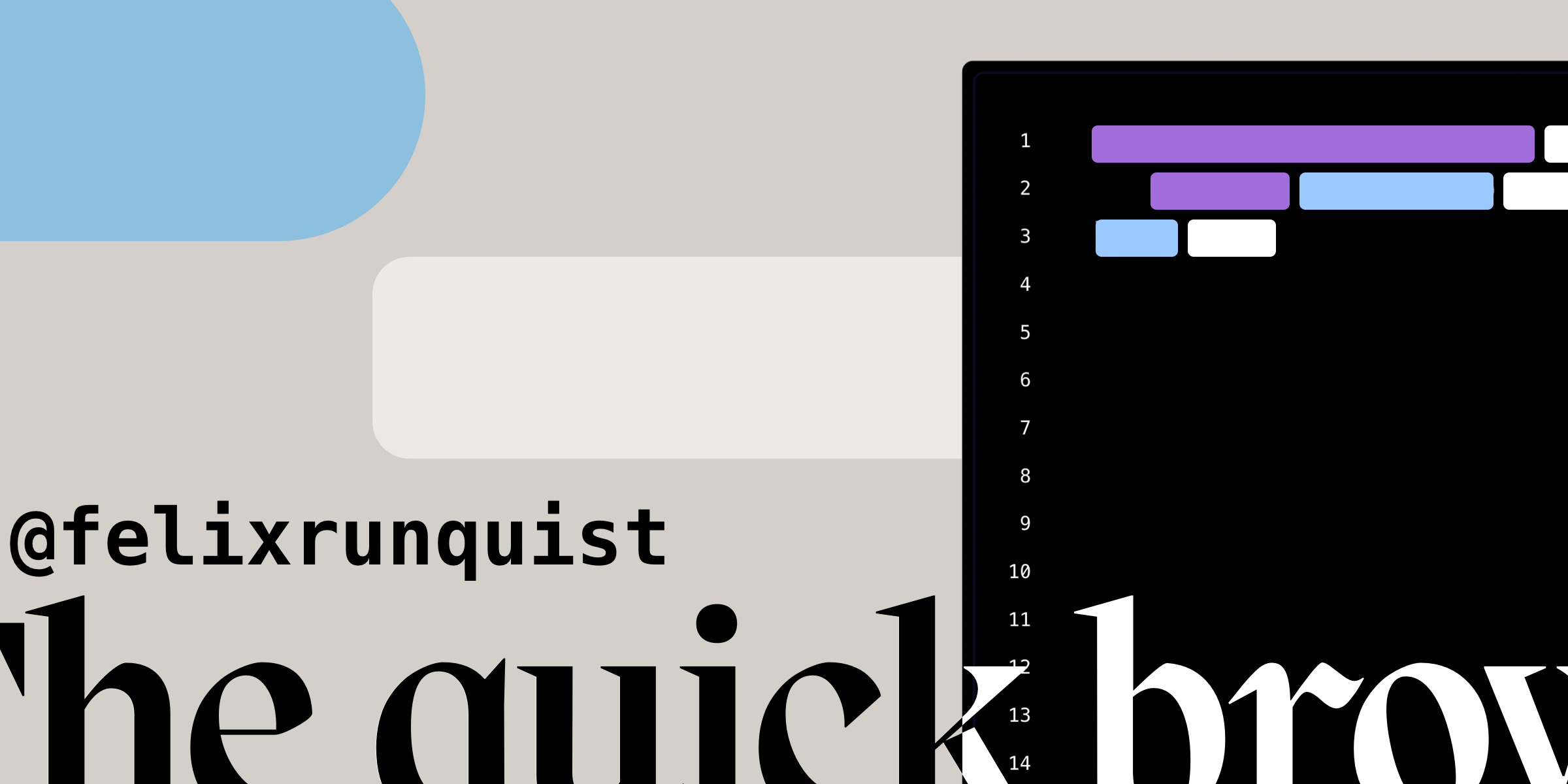
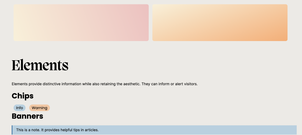
Design
To make the colors and fonts I use on this website easily retrievable, I made a design page which groups common elements. You can find the page here.
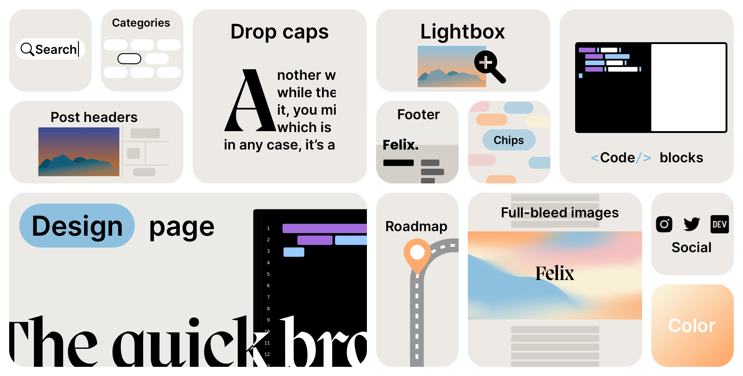
A never-ending journey
I believe a website is never fully finished, and there are always tweaks that can be made. I've compiled a list of things I'd like to change, and you can track my progress here. As a bit of fun, I wanted to explore the current trend that are bento grids and create one featuring everything I've changed as part of the redesign.