Web design inspiration: Ten perfect examples

Table of contents
In no particular order, here's a collection of websites I find inspiring, both by their design and their functionality. For each website, I'll dive into the specific details which made me want to mention it.
While I do feature personal as well as corporate projects alike, I do my best to credit the original creator when possible.
1. Carl Hauser's blog
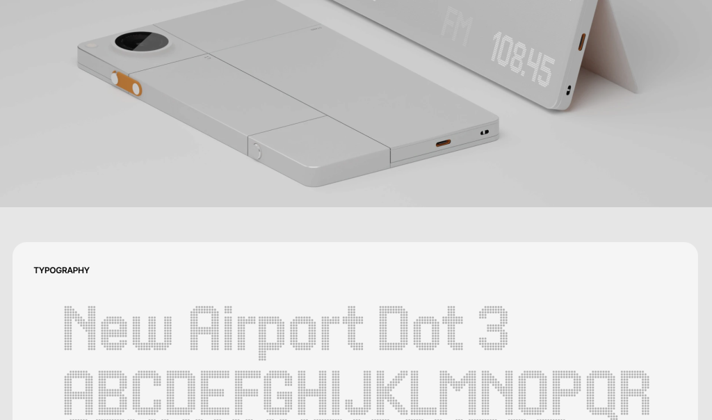
Carl Hauser's website is a showcase of personal design products he has made. I love the minimalist aesthetic of the website: each element is separated into a rounded box, and the color combination of beige, black and yellow works really well. On the homescreen, you're greeted by a page of rough sketches, the date and ID on top gives them an industrial feeling.
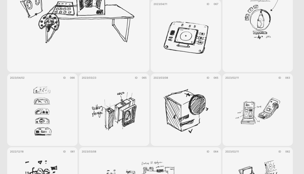
The projects page lists more finished projects, with detailed design, color scheme and typography for each product. The intricate renders make you feel like you're looking at a finished product, which could be the next product unveiled by Apple or Nothing.
Carl Hauser also has an Instagram page where he features his designs.
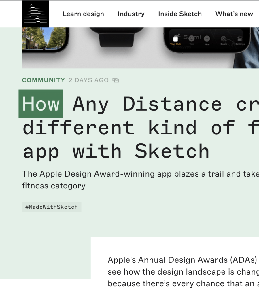
2. Sketch Blog
I chose to feature the Sketch Blog not for the content, but for the design of the site – from its soft pastels to the well-chosen monospace heading font, the look and feel is stunning. The devil being in the details, I particularly like the way margins work out: the content margin is aligned with the header so they both start at the same position.
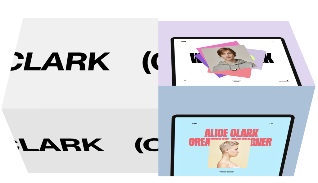
3. JP Silva's portfolio

JP Silva's website breaks the boundaries of web design and introduces interesting ways to navigate, from the rotating cubes that allude to Rubik's cubes, to the scroll-based animations. The use of an uppercase font is interesting.
4. Vita Architecture
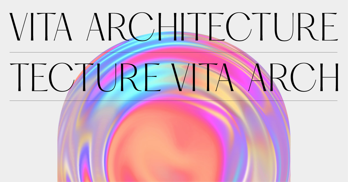
Vita Architecture is a great example of motion-first design. From the moment you hit "enter" in the search bar, you're transported to a site with flowing visuals and extensive imagery. Anything from scrolling to clicking a link provides a contextual animation which makes the entire site feel fluid. Plus, this website has been previously featured by Apple in a product announcement!
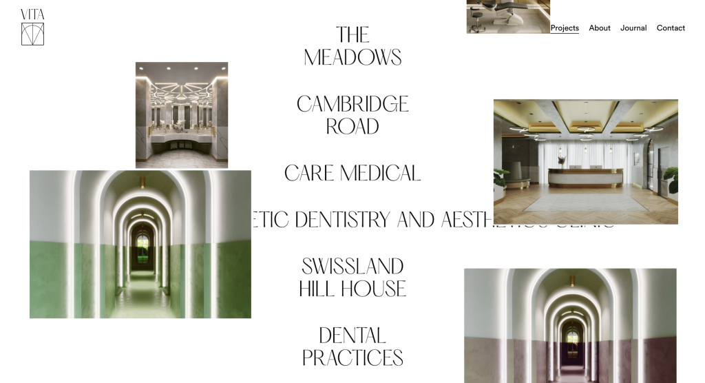
The only critique I have is the customized scrolling behavior which is jarring – I don't recommend changing the default scrolling behavior (the speed/direction) as it feels counter-intuitive for the user who is used to the way native scrolling works on their device. It can feel like wading through sludge!
5. Outreach.space
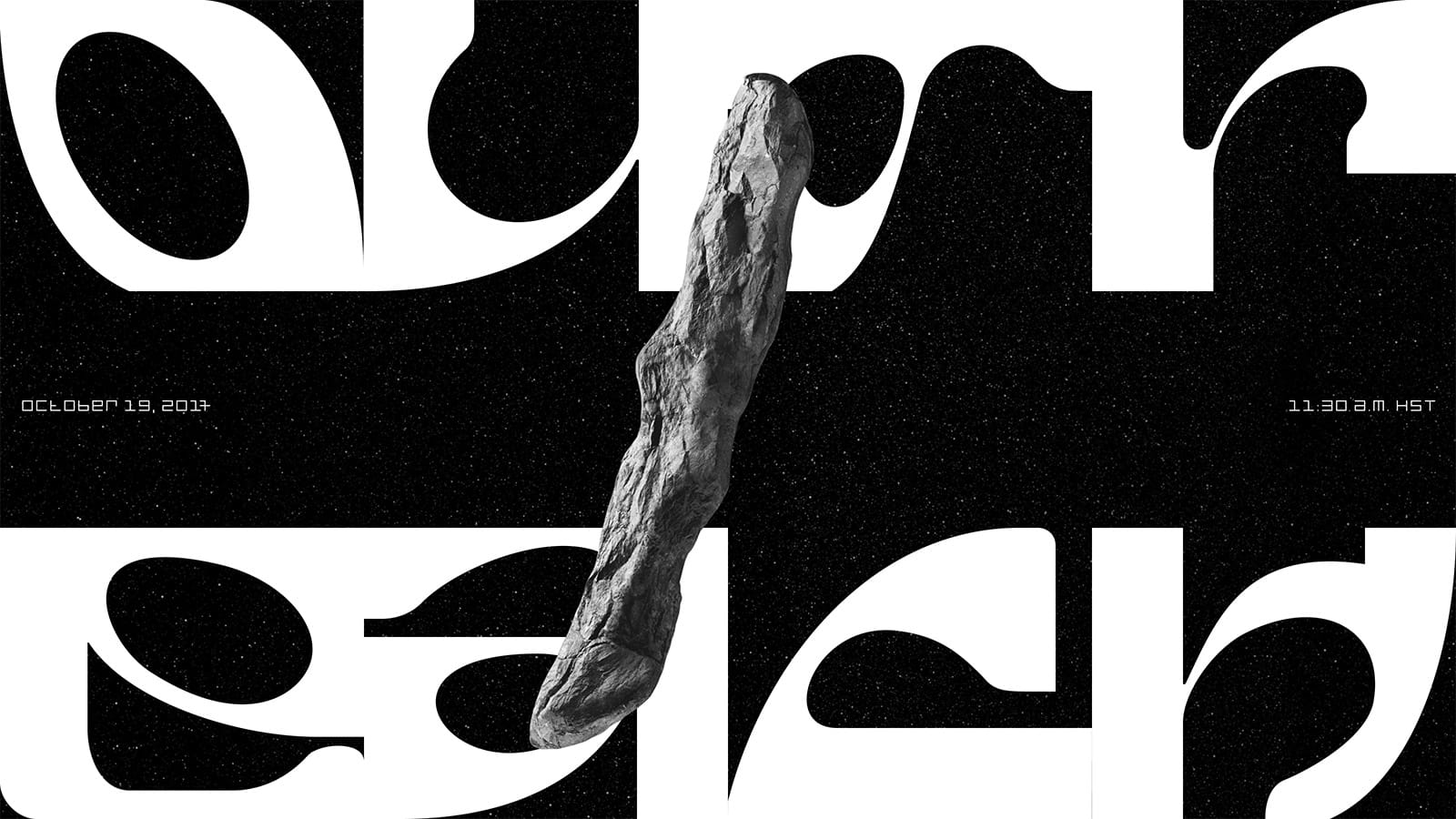
Outreach tells the story of a space voyage, and the discovery of a weird asteroid. It makes you feel like being teleported through space, and the delightful visuals interspersed with
I love the use of Garamond, reminiscent of the typeface Apple used in the 80s. Plus, this site is built on Next.js and hosted on Vercel, just like mine, so it's nice to see what can be done with these frameworks – there really is no limit!
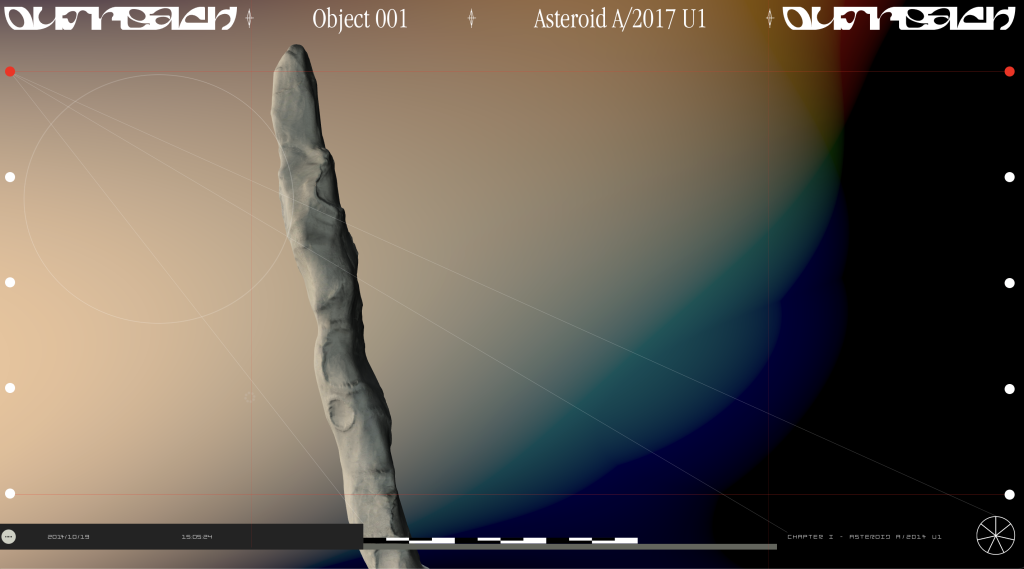
The only disturbing thing is the loading modal – it isn't interactive and scrolling on isn't disabled when the modal displays. Since it's a content-heavy site and therefore takes a while to load, the loading modal was displayed for a while – I thought the site was broken – providing more intent as to the loading state, for example an animation, could help with this.
6. Tinkersynth by Josh W. Comeau
Tinkersynth is a website that lets you create visual art by using a waveform generator, much like you would use a synthesizer to generate sounds. It's a fun tool, with many whimsical details built into it, like each button having a little animation on click.
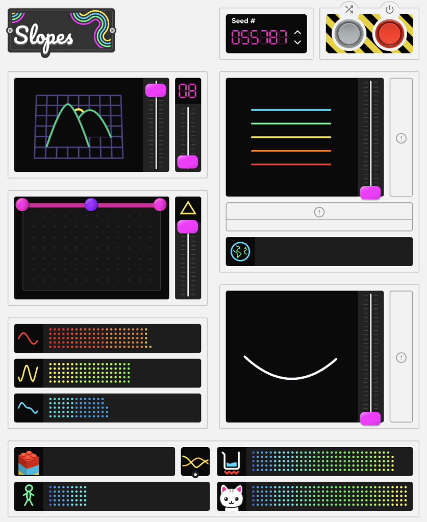
Tinkersynth was built by Josh W. Comeau, a React developer and course writer.
7. Atmos
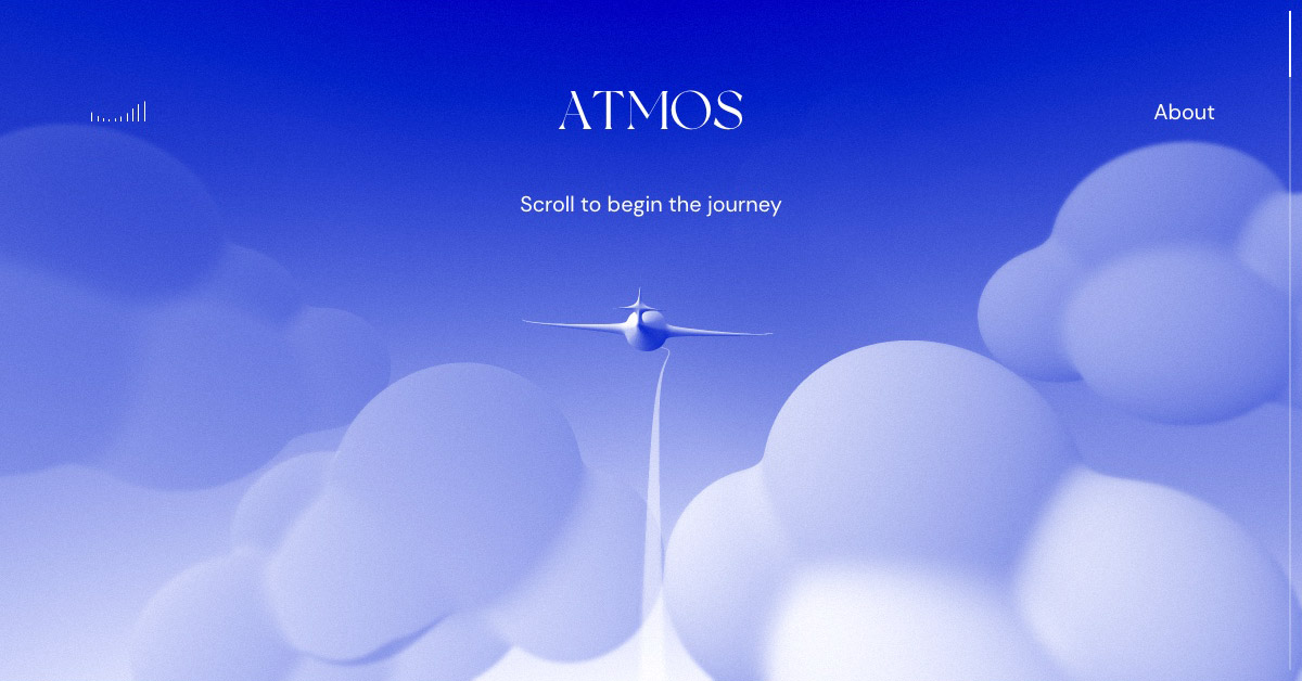
Atmos is an interactive experience built on Three.js. From the grainy yet simple visuals to the relaxing sound effects, It was developed by Leeroy, a Canadian web design agency. I particularly like the choice of colors – soft blues and warm orange tones which make you feel like you're up in the sky. The airy music is well chosen to add to the effect, it almost makes you feel like you're in a meditation session.
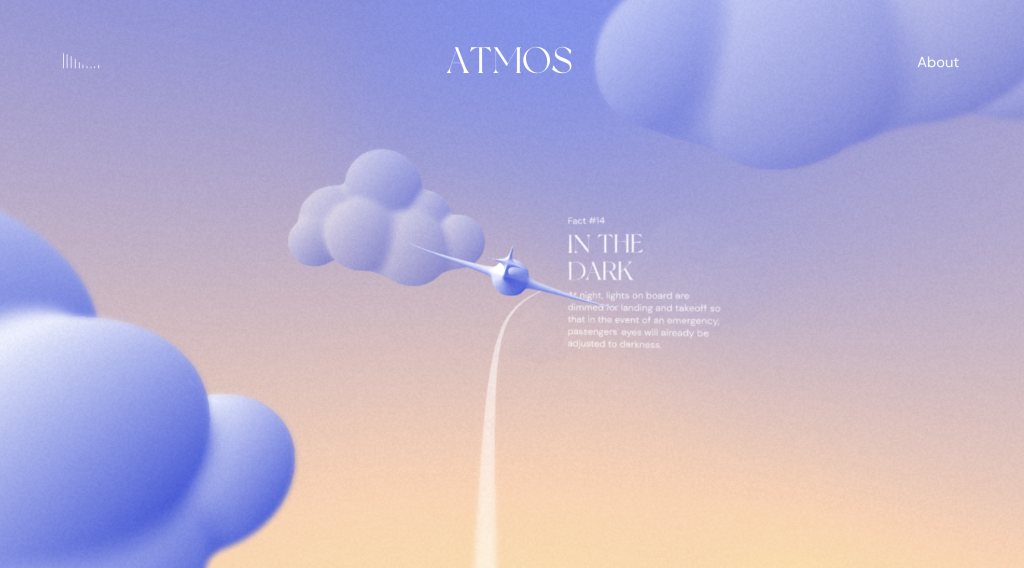
This post on Awwwards delves into the design of the site and some of the choices that were made, from the path the airplane follows to the bubbly clouds. It's truly amazing that such an immersive experience can be created using only web technologies.
P.S: try to spot the easter egg!
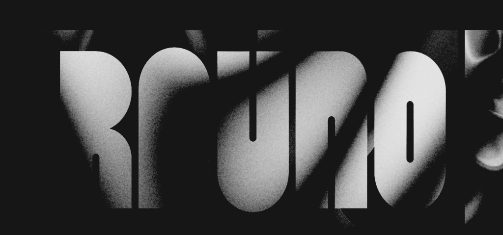
8. Rauno Freiburg's portfolio
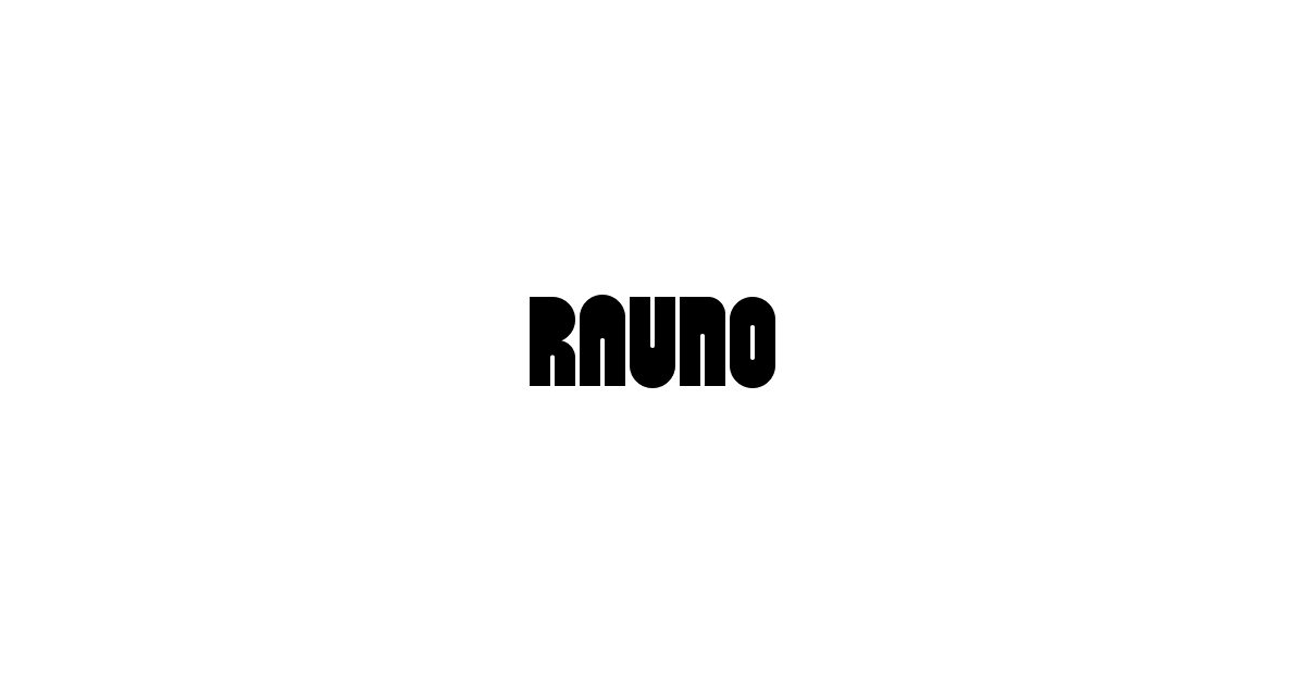
I love the shader effects, how it fades away to reveal the content when you scroll. The navigation is unconventional (it resembles the MacOS dock), but certainly functional! Rauno has rethought how users should interact with elements. The crafts page features a feed on what he is working on, and I love the interactive demos! He's also built separate projects, uiw.tf and ui.gallery, which explore unconventional yet intuitive ways to interact with visual content.
The more time you spend on the site, the more details you see – like sound effects or the "last visit" location indicator: it fills you with a moment of unbridled glee to see your location as last visited when you refresh the page (unless you use a VPN, of course).
9. Cobbler

Something very striking is the bold color palette the designers chose to go with this site. Surprisingly enough, the saturated blue and pale green work extremely well together! The bold, outlined shapes and grainy backgrounds add to the look, and it makes for a very polished site. I'm obsessed with the font they use, Helveesti, which has mini serifs and a slight tapers on vertical stems.
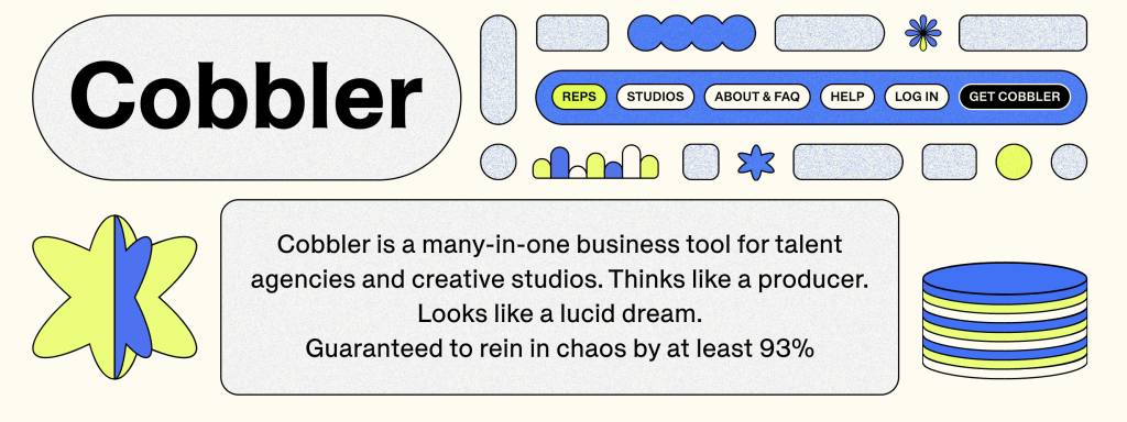
If anything, the animated visuals and colorful elements could be drawing the user away from the actual content (case in point: I've scrolled through the website, visited a few pages, yet I can't remember what services Cobbler provides...).
10. Cosmos.so
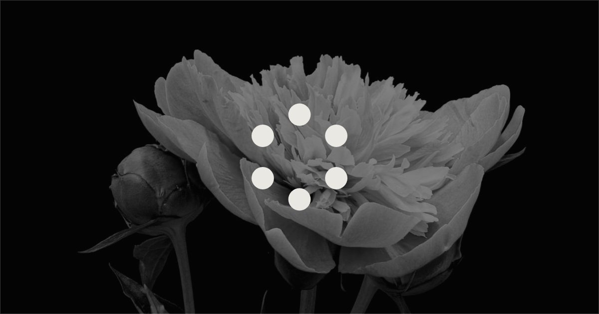
Cosmos is positioning itself as the new Pinterest alternative. To showcase this, they've built an interactive website. In particular: the manifesto page. It's such a calming experience, from the music to the scroll-controlled timeline, which makes a flower bloom in the background.
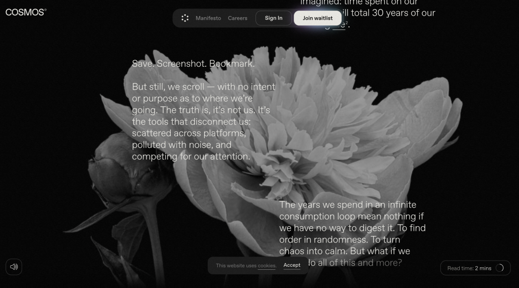
The dark/light theme transition is very well thought-out, the entire experience feels delightfully intuitive. An issue to point-out accessibility-wise: the scroll bar is customized as well as the scrolling behavior – this can make the user feel unsafe from the native implementations.
11. A bonus one: Bento layouts
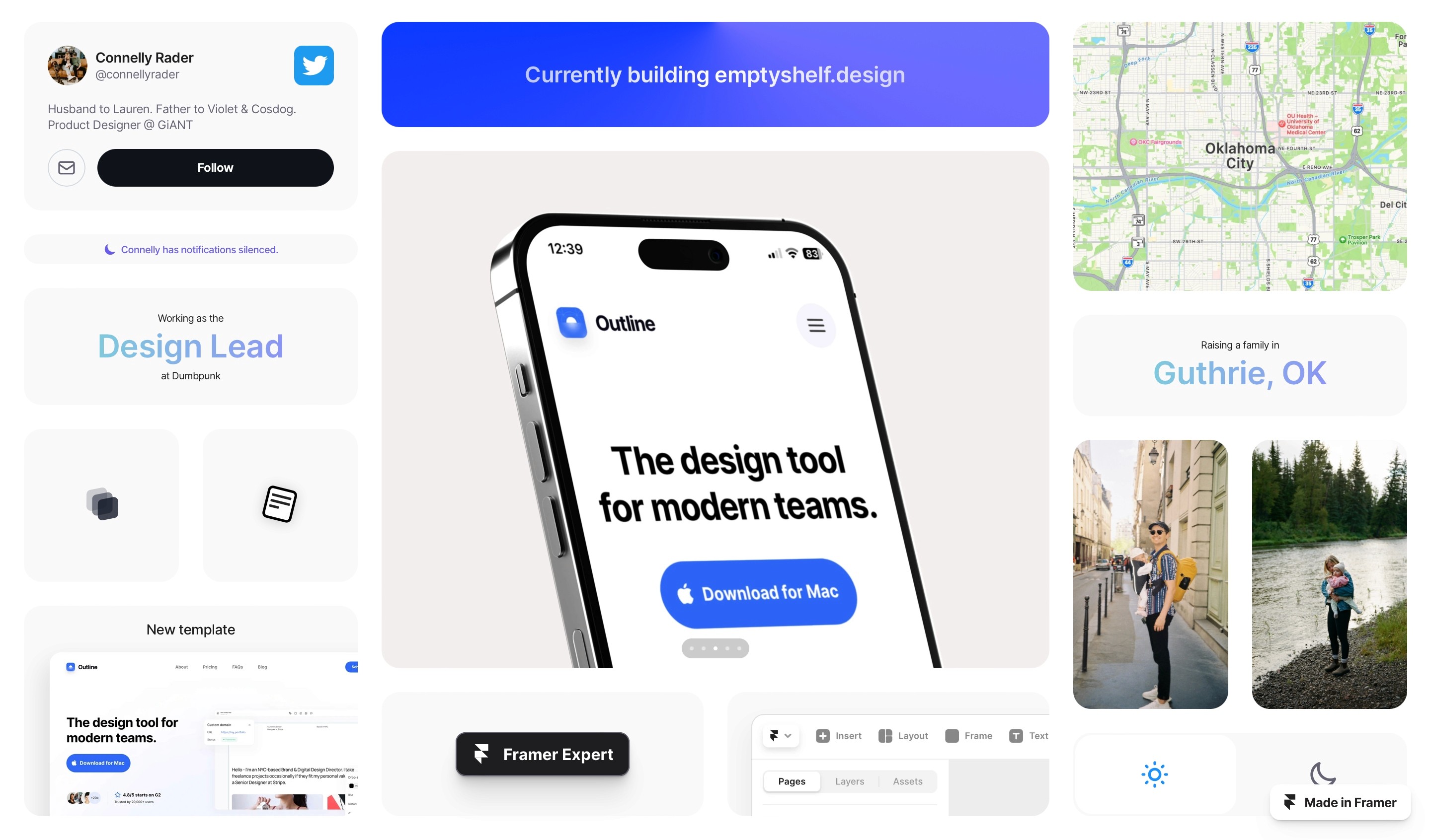
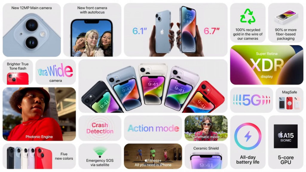
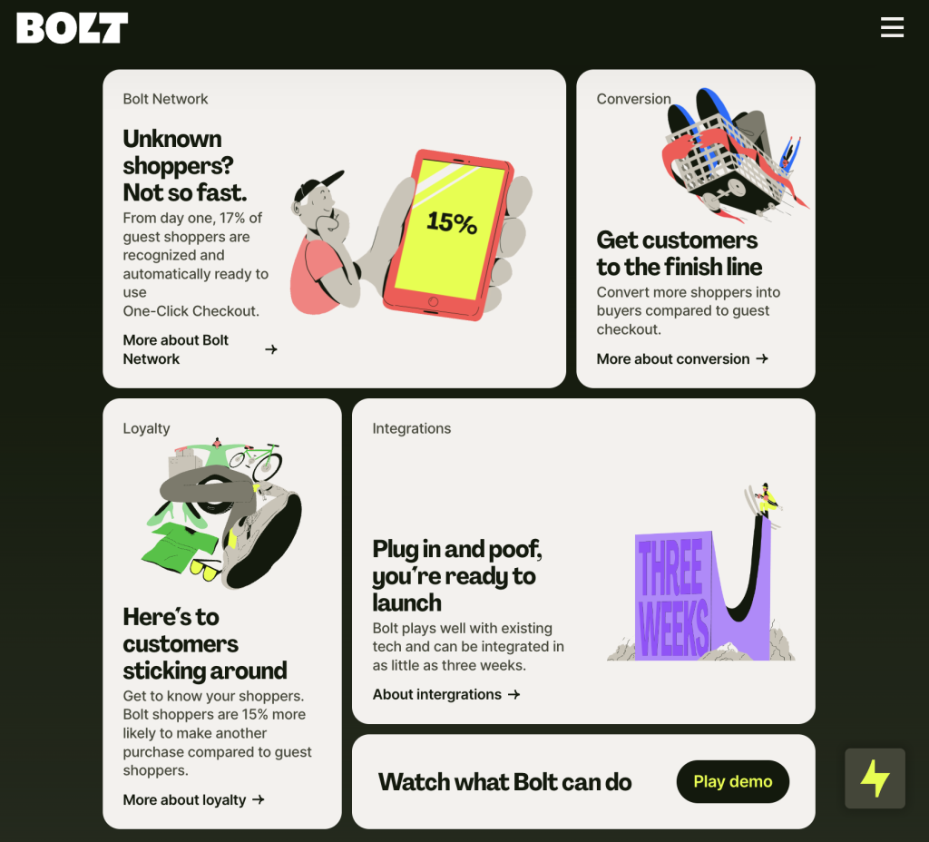
Here's a bonus one. This is less of a particular site, but more of a general design trend that has blew up lately on Twitter. After Apple has begun using groups of little cards in a grid to summarize what has been presented, people followed suit and the form has been termed "bento box": A group of rectangular elements in a grid. The site I've linked is an excellent example of Bento Boxes, and I'll share some other ones below.
There's even a site to make your link in bio as a bento: bento.me