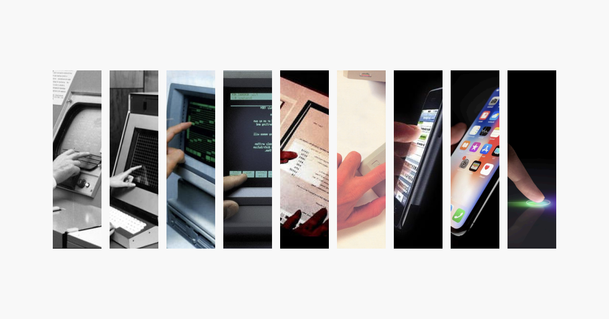
Since the beginning of the digital age, the way we present contant has constantly evolved. From printed tape to blinking lights to ascii terminals, right until the development of the graphical user interface with the Xerox Alto and the Macintosh, there was one thing in common: severely limited computational resources. In fact, resources were so limited that one could see content animating before one's eyes.
Scrolling through a list of files on the Apple Lisa. Credits: Zhizu.com
With the technological improvements in computing power, this got to the point where the delay in content animation became imperceptible to the human eye. What would once appear gradually now became a jarring flash to the user. This raises an important question: How does one provide contextual information to the user?
The answer: Voluntarily slowing down the speed at which content presents itself. This is done by allocating some computer resources to tweening content, i.e. creating intermediate frames between the first and last state, and there you have it: an animation. It might seem paradoxical to use more computer resources towards doing what one used to do with fewer resources, but it actually provides more information to the user.
If you've been on any form of digital device in the past fifteen years, you've most experienced many different types of animations. Animation, when done right, can make content feel more natural and less stark to the user. However, all these options have led to a widely diverse set of implementations: We've all come across the one site which dispenses with any animation (Jarring cookie banners for example), or even worse, a site that implements animation, but in a way that feels counterintuitive. It's the wild west out there. This post aims to provide good practices for animations, as well as ways to implement them on the web, in Javascript and CSS.
A cookie banner that is disruptive and annoying
Reasons for using animations
There are many cases for using animations can improve user experience:
User-triggered: These are animations that run after a user action like pressing a button or opening a new window.
Loading states: These trigger when content is being fetched or a lengthy process is running – it provides reassuring feedback to the user and lets them know that the page isn't hanging.
Presenting content: This helps content that might not be expected by the user seem less jarring, such as a notification for example.
How can we make animations feel more intuitive? By imitating the physical world. In the words of the first Apple Human Interface guidelines in 1987, use metaphors from the real world. Users are already familiar with the movements of objects in the real world, and by replicating these, we can create motion that feels intuitive.
A good way to get a feel for good animations is to get inspiration from existing, well-designed websites. A lot of the websites I mentioned in my article on web design are good examples of this.
How does a physical interaction work?
Let's go through a bit of physics to understand how interactions work (If you don't like physics, you can totally skip this section!). In the human-scale physical world, we use Newtonian dynamics to study the evolution of an object in space. An object is subject to multiple forces, and these contribute to the change in velocity through a simple equation:
ma=i∑Fi(1)
The product of mass and acceleration of an object is equal to the sum of the forces. This is known as Newton's second law.
When it comes to a spring, a specific force is present, which tends to pull it back to its resting position – this is known as Hooke's law:
F=−k(x−x0)(2)
Where k is the spring constant, a measure of its stiffness, l0 is the resting position and l is the position of the spring.
Another thing to take note of is derivatives. Speed is the derivative of the position with respect to time, acceleration is the derivative of velocity with respect to time:
v(t)=dtdx a(t)=dtdv=dt2d2x
If we combine the two previous equations (1 and 2), we get the following:
mdt2d2x=−k(x(t)−x0)
For any of you that have studied maths on a higher level, you'll recognize that what we have is a differential equation, i.e an expression of a function based on its derivatives. The mathematical resolution is beyond the scope of this article, but the essential thing to retain is that we can get an expression of the position of an objet at a given time based on the forces that act upon it. The solution of the above differential equation is the following:
x(t)=x(0)cos(ωt),ω=mk
Here's a simulation of a spring controlled by such a force.
You'll instantly notice something that feels wrong with the animation: It continues infinitely! That's because there's no loss of momentum. In reality, there is energy loss which leads the spring to a stable state. In a spring, this is called damping. Think of it as an object attached to a spring scraping against the ground. The friction slows the object, bringing it to an eventual stop.
The damping force is represented as a function of velocity:
Fd=−dv(3)
Where d is a measure of the damping force intensity.
By combining all the forces above (1, 2 and 3), we get the following differential equation:
mdt2d2x=−k(x−x0)−αdtdx
With the following solution:
x(t)=x(0)e−βtcos(ωt),β=2mα,ω=mk−(2mα)2
As the damping force represents energy loss through friction, which is almost always present in the real world, it leads to a much more realistic simulation.
Phew! That was a lot of physics. Let's see how we can implement this in the context of a web-based animation.
Spring animations
Let's look at the basics of a spring animation. There are three main things we can control:
Mass (m)
Spring stiffness (k)
Damping (d)
You'll notice that, contrary to usual CSS animations, we don't control the duration of an animation. This is because controlling timing makes you lose control of speed. For example, a 0.2s-long animation could be rather slow for an element which doesn't move much, but it could be extremely fast for an element moving across the screen. We can get a precise idea of an easing function by studying a graph of it: On the horizontal axes time is represented, and the progress on the vertical axis:
Easing or timing function?
The terms "easing function" and "timing function" are used interchangeably to define the function that specifies the speed curve of an animation (W3 schools). However, I prefer and will use the term "easing function" as timing function seems to imply that you can control the duration of an animation, and I just mentioned that we are not seeking to do that.
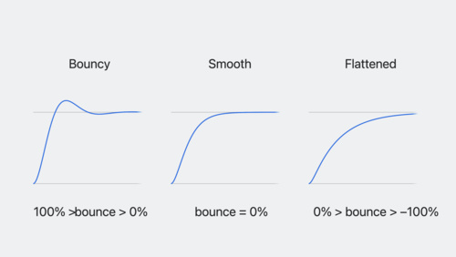
When we think of a spring, we tend to think of it as being bouncy. However, springs don't necessarily have to bounce; they actually have two characteristics:
Overdamped: The spring doesn't bounce.
Underdamped: The spring will bounce.
The condition for an overdamped spring is the following:
d>4mk
Try adjusting the sliders in the following simulation to see how each parameter adjusts speed and bounce.
CSS implementation
There are a few ways to implement spring animations. As we have to consider characteristics such as mass, and damping, Bézier curves are ineffective for this. I first wanted to try a CSS-only implementation, to make spring animations as easy as other easing animations, however there are a few difficulties to consider:
At its native level, CSS does not allow the implementation of user-defined functions
There is no way to use transition easing functions other than the ones provided (ex: ease-in or quad), or using Bézier curves
This means that we need to use a CSS pre-processor, such as Sass, to calculate the easing function. This is how it works: We'll first define functions in Sass to calculate our spring values, then implement these as an animation. Next, we'll use CSS animations as substitutes for transitions. Here's the function defined in SASS:
As you can see, implementing spring functions in CSS is complex, and involves hacky workarounds. While the SASS function is simple enough, it still lacks functionality such as timing and compiles to CSS which is over 600 lines long. It's much easier to do this in Javascript. One could implement an equivalent spring function manually, or use libraries which already support spring animation, such as framer-motion.
I found an npm package called sass-spring which allows for more control, however the documentation is very sparse and I couldn't get it to work.
Javascript implementation
Framer motion, as its name suggests, is a tool created by Framer to make it easier to implement animations in React. It provides motion-enabled equivalents for many HTML elements, such as divs. The great thing about this package is that it allows for much more flexibility than CSS transitions, for example animating to an auto width.
Here's an example of animating with framer-motion in React. We're creating a draggable div that animates back to its resting position when released.
It's this easy! The great thing is that you can save transitions in a file so that they're easy to reuse in your project and so that they stay consistent:
If you want to implement spring animations manually in Javascript, Maxime Heckel wrote an excellent article on it!
Design considerations
There are a couple of things to keep in mind when animating: accessibility and performance.
Privilege GPU-based animations
In a web browser, animations can be processed by the GPU or the CPU. It's best practice to run animations on the GPU: it's specifically designed to handle graphics, whereas the CPU is less suited for the task as it has to run other processes as well. Such animations that run on the GPU are called composited animations. I won't go into details, but for the most part, animations leveraging the transform or the opacity properties are composited.
Let's see how one might implement this for an animation that expands content into full-screen. We don't want the content itself to change size, we just want the container to clip it. One might think of leveraging the clip-path property, however animations on this property are non-composited so they aren't optimized. Instead, one could scale the container, and apply an inverse scaling on the content. This ensures that we use composited animations, and setting the overflow property to hidden will prevent children from appearing beyond the container limits.
The container with overflow set to hidden, clipping its content when one scales it. The content has an inverse scaling to make sure it stays the same size.
Lastly, avoid animating properties which are heavy on resources, such as blur.
Make sure spring animations are necessary
As spring animations do have a bit of overhead compared to classic CSS animations, make sure the additional step of implementing a spring animation will be noticed. Animations are most distinguishable when using properties that influence the scale and position of an element. Other properties, such as opacity or color, are clipped outside of their bounds, meaning that you won't see a bounce effect. These properties can be animated using classic CSS easing functions as it's difficult to perceive the difference.
Put native interactions first
For many device interactions, an OS implementation already exists. Scrolling, for example, is specific to each device, and the user is already comfortable with the way their device implements these through continued interaction. Before overriding the default interactions, consider whether it's really necessary: It could leave the user confused that things aren't working the way they're used to. Plus, you run the risk of breaking accessibility features implemented by the operating system.
For example, if you want to implement a smooth scroll animation when navigating to an element on the page, instead of implementing your own version of it, use the native API: window.scrollTo. This will make sure that the OS handles scrolling, and that it will animate the way the user is used to. Here's an example of smoothly scrolling to an element in React:
exportdefaultfunctionApp(){functionsmoothScroll(e){e.preventDefault();//Prevent default "jump" scrolling behaviorconstelement = document.querySelector(e.target.getAttribute('href'));constrect = element.getBoundingClientRect();window.scrollTo({top:window.scrollX + rect.top,behavior:'smooth'});}return(<><aonClick={smoothScroll}href='#element'>Click me to scroll to #element</a><divstyle={{width:'100vw',height:'100vh'}}></div><divid='element'><p>I'm #element!</p></div></>)}
Complement, not distract
Animations should complement the user, not distract them. Like the annoying cookie banner example above, use of animations shouldn't grab attention but merely improve the user experience by providing context. If an object expands from a closed state, it shows that it is the same and provides more context.
Animation frequency
Consider the amount of times the user will be triggering the animation: If it's just a few times, an animation could surprise the user and give originality to your website. If the user experiences the animation quite often, however, it could start to feel sluggish.
For example, launching an application on Mac never results in the window animating as it opens. This is because during normal use, a user could be opening dozens of applications a day, making the animation redundant. Even though it could be perceived as janky to see a window pop up without notice, this is expected by the user as they triggered it. Plus, it makes launching applications feel faster.
In contrast, even though a user could be receiving many notifications a day, these are unexpected, meaning that they often aren't user-initiated. A sliding animation helps the user contextually.
Not every design follows this. For instance, Microsoft in its 2016 Office update decided to animate all cursor movements in Word, Powerpoint and Excel. This is a great example of what not to do: users generally type thousands of characters, meaning the animation runs thousands of times, and instead of feeling snappy, like the press of a key, it feels sluggish. The typing of a character is user initiated, so it's expected, making it a great candidate for a non-animated transition (I should also note that Microsoft has been known for its questionable design practices, such as putting the Shut Down and Restart buttons in the Start menu, something I didn’t think much of until an older friend pointed out the oxymoron).
Animated caret in Word 2016The caret isn't animated in the current version of Word for Mac
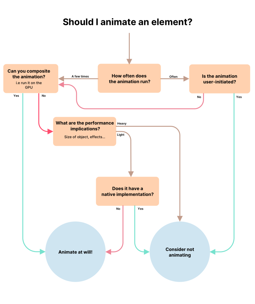
A flowchart to help decide whether you should animate an object of not
Lastly, beware of animations that can become associated with annoyances, such as an animation appearing consistently during frustrating moments.
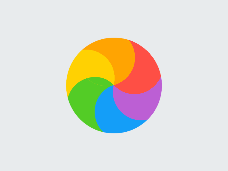
The spinning circle of doom, on Windows and MacOS respectively.
Further reading
There are a lot of great resources out there to help with animation, as well as implementing animation while considering design principles. I'll list a few here.
Apple has released an amazing video in WWDC 23 on creating spring animations.
Animate with springs – WWDC23 – Videos – Apple Developer
Discover how you can bring life to your app with animation! We’ll show you how to create amazing animations when you take advantage of…
As I was writing this article, Rauno Freiburg wrote an extremely detailed article on the intricacies behind interaction design. He explores motion and what makes good design.
Maxime Heckel dives into details on the implementation of spring physics in Javascript. If you want an in-depth explanation on the workings of Framer Motion's spring animations, I suggest you have a read.
The physics behind spring animations – Maxime Heckel’s Blog
A deep dive into the inner workings of spring animations in Framer Motion.
Google released an easy-to-read article on the workings of a web browser. It's in 4 parts and helps understand how different items are rendered during different processes, and how to write performant code which leverages in-browser optimisations. Parts 3 and 4 are extremely helpful!
Inside look at modern web browser (part 1) – Chrome Developers
Learn how browser turn your code into functional website from high-level architecture to the specifics of the rendering pipeline.
Conclusion
We've seen the evolution of animations in the past fifty years, as well as some examples of good and bad animation design: Not every animation improves the user experience. We should keep in mind not to use animations as distractions, and to be careful of animations that can quickly become frustrating. After time, one develops an intuition for which animation is right. I discuss examples of good design animation in the following post.
We've seen CSS and Javascript implementations of spring animations, which are a realistic representation of everyday physics. Look out for the everyday animations you see, such as the swaying of a branch in the wind, or opening an app on your smartphone, and see if you can distinguish which type of animation it is: damped or undamped, bouncy or not.
Navigating the internet has become difficult with all the accessibility issues, pop-ups, cookie banners and advertisements. We’ll explore different ways to make the web a more welcoming place for humans.